OF BELL CURVES AND YIELD CURVES
Markets: specifically the bond market, which has been going nuts for about a week. When I trade, meaning intra day, I trade bonds or the S&P. When I do I use an intra-day charting method called Market Profile, which are the trades during the day charted on an axis that results in a bell curve chart (below). This type of chart tells you how many trades occur at each price along the axis. The letters represent each thirty minute time period, with A being the earliest. In the below example, you see that most of the trade for the day occurred at 111.17. You trade within the opening range. (CBOT has a course if you're interested; it's also called Liquidity Data Bank.) A bond chart like the one below, would show a wide range on that day, ideal for intra day trading. Most of the trades that day were at 111.17; the range of trading was between 110.24 and 111.24; a thousand dollar range in which to trade. A money making day. This was a long preface to tell you the range on the bonds plotted on this axis for a week is astonishing. It means all the players are in a panic about interest rates because Greenspan has done his best to kill the housing market; and, once again, it looks like he's succeeding. He's cleverly putting all the carpenters, sheet metal men, and so on, out of work. Remember, everyone knows the genius has caused the last three recessions by overshooting a rate rise and he keeps on making the same mistake, one that you and me pay for dearly.
Meta-PROFILE REPORT FOR 01 30 03
AND SEGMENTED AUCTION
COMMODITY -- T-BOND (CBOT) DAY MAR 03
Price Brackets Segmented Auction
11124 GL G L
11123 GL G |L
11122 FGKL F G | | |K |L
11121 FGHKL F G H | | |K |L
11120 DFGHKL D F G H | | |K |L
11119 DFGHKL D F G H | | |K |L
11118 DEFGHJK D E F G |H | |J |K |
11117 DEFGHIJK D E F G |H >I >J >K >
11116 DEFHIJK D E F | |H |I |J |K |
11115 DEFHIJK D E F | |H |I |J |K |
11114 DEFHIJK D E |F | |H |I |J |K |
11113 DFHIJK D |F | |H |I |J |K |
11112 zDFHJK |z D |F | |H | |J |K |
11111 zDFJK |z D | |F | | | |J |K |
11110 zD |z |D | | | | | | | |
11109 yzCD |y |z |C |D | | | | | | | |
11108 yzCD >y |z |C |D | | | | | | | |
11107 yzCD |y |z |C |D | | | | | | | |
11106 yzBCD y >z | B >C >D > > > > | | | |
11105 zBCD |z | |B |C |D | | | | | | |
11104 zBCD |z | |B |C |D | | | | |
11103 zBCD |z | |B |C |D | | | |
11102 zBD |z | |B | |D | | | |
11101 zB |z | |B | | | | | |
11100 zAB |z >A >B | | | | | |
11031 zAB z |A |B | | | | | |
11030 zAB z |A |B | | | | |
11029 zAB z |A |B | | | |
11028 zA z |A | | | |
11027 zA z |A |
11026 zA z |A |
11025 zA z |A |
11024 z z |
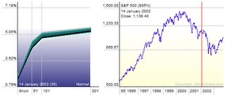
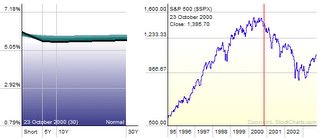
Another graphic is called the yield curve which compares short term rates (3 month) to the ten year rate. Naturally the 90 day note should pay you less than the long term TEN YEAR bond. (Shown below on left) As we speak we are entering into inverted yield curve territory (below on right), showing that the short term (90 day) is actually paying you more than the long term 10 year--think about that. This an almost sure sign of recession, caused by the Federal Reserve bank, again. I cannot tell you how scary this is and why people are literally ready to jump off bridges.
NORMAL
INVERTED---NOT NORMAL AT ALL
2 comments:
because Greenspan has done his best to kill the housing market ...
I don't agree with that Howie. I think Dr. Greeenscam has finally realized that his FED has kep interest rates too low, thereby creating inflated asset values in real estate and in equities.
You are just "talking your book," Howie. Your vocation is peddling stocks or mutual funds, therefore you want interest rates to stay too low.
-- david.davenport.1@netzero.com
I've never sold stocks or mutual funds. My game for the last twenty years has been commodities and I really know my shit. This post is totally accurate and all you have to do is look at the bond charts to see it. I don't give a fuck about rates. I do give a fuck about inverted yields and their relationships to a recession, and I am unquestionably correct.
Post a Comment